Posts Tagged ‘viz’
Watch Cities Spread Across The Planet Over 5,000 Years
Tuesday, June 21st, 2016Watch Cities Spread Across The Planet Over 5K yrs
http://www.huffingtonpost.com/entry/history-of-cities-urbanization-map_us_576433f3e4b0fbbc8bea3eda nice #dataviz of 10K pts of urban population data HT @NAChristakis
How Much Warmer Was Your City in 2015? – The New York Times
Friday, February 19th, 2016How Much Warmer Was Your City in ’15
http://www.nytimes.com/interactive/2016/02/19/us/2015-year-in-weather-temperature-precipitation.html#new-haven_ct Great #viz of NHV’s freezing Feb. & hot Dec. HT@chaubtu
The Tail End – Wait But Why
Thursday, February 11th, 2016The Tail End, Wait But Why
http://waitbutwhy.com/2015/12/the-tail-end.html Great #viz of an entire life; ~33k days in 90 yrs fits into a small fig via
@suganthibala
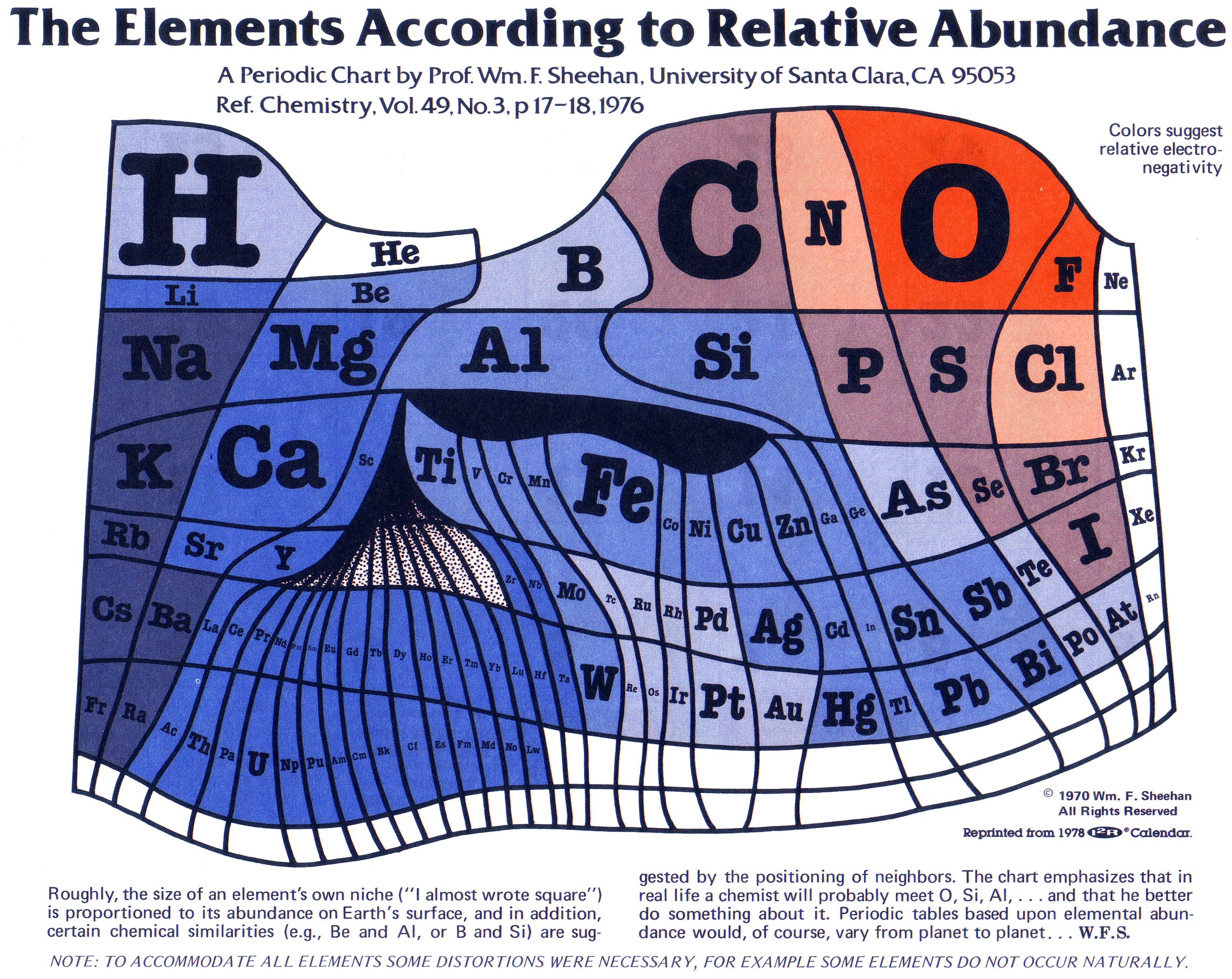
relative_abundance.jpg (3038×2414)
Tuesday, December 30th, 2014Periodic Table, scaled to abundance on Earth http://bit.ly/1rlyfSx pic.twitter.com/n9Xbfoe8x1 Illustrates importance of 1st row HT @pickover
http://www.meta-synthesis.com/webbook/35_pt/relative_abundance.jpg
BoxPlotR: a web tool for generation of box plots
Sunday, September 21st, 2014They published a paper on a web tool to generate box plots !! http://www.nature.com/nmeth/journal/v11/n2/full/nmeth.2811.html QT:{{”
Despite the obvious advantages of the box plot for simultaneous representation of data set and statistical parameters, this method is not in common use, in part because few available software tools allow the facile generation of box plots. For example, the standard spreadsheet tool Excel is unable to generate box plots.
…
M.S. and J.W. conceived of the box plot tool
“}}
Related:
http://bioinformatics.oxfordjournals.org/content/early/2014/01/21/bioinformatics.btu038.abstract
D3.js – Data-Driven Documents
Monday, September 15th, 2014WIRED August 2014: The Price of Life
Monday, September 1st, 2014The Price of Life http://contentviewer.adobe.com/s/Wired/5857345fd35d4d1f9a1f00273013f68a/WI0814_10_Folio/2000_2208IN_deathvmoney.html Nice #visualization of NIH #funding, showing emphasis on #cancer & diabetes v heart disease
Big Data and Its Technical Challenges | July 2014 | Communications of the ACM
Saturday, August 30th, 2014#BigData & Its Technical Challenges
http://cacm.acm.org/magazines/2014/7/176204-big-data-and-its-technical-challenges/abstract Data acquisition, cleaning, aggregation, analysis, visualization & interpretation
Flurrish – Times Table
Sunday, August 3rd, 2014Jason H. Moore, Ph.D @moorejh · Jul 5
MT @randal_olson #visualization of the hardest parts of the
multiplication table #math #edchat
http://www.flurrished.co.uk/blog/2013/07/03#the_hardest_times%20table
MT @moorejh @randal_olson #viz of hardest parts of the times table; note, difficulty of 10*11
http://www.flurrished.co.uk/blog/2013/07/03#the_hardest_times%20table http://pic.twitter.com/hAeVd49XZX
http://www.flurrished.co.uk/blog/2013/07/03#the_hardest_times%20table